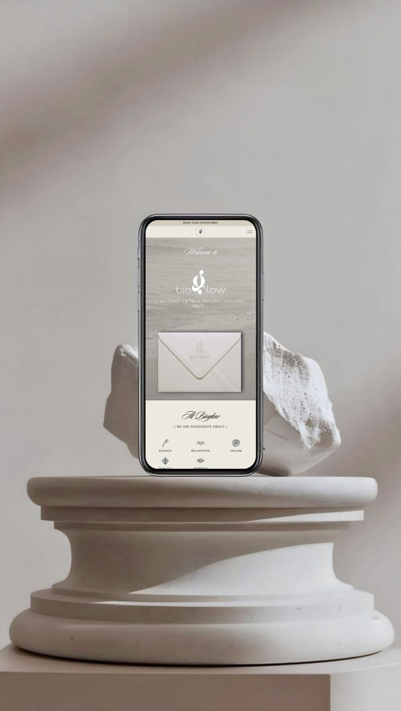
branding & web project
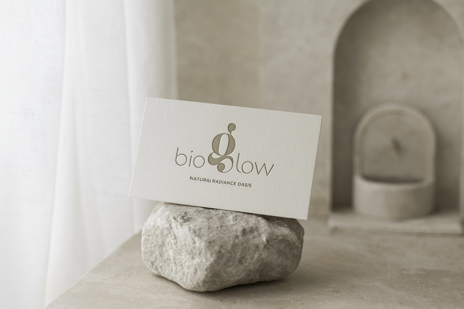
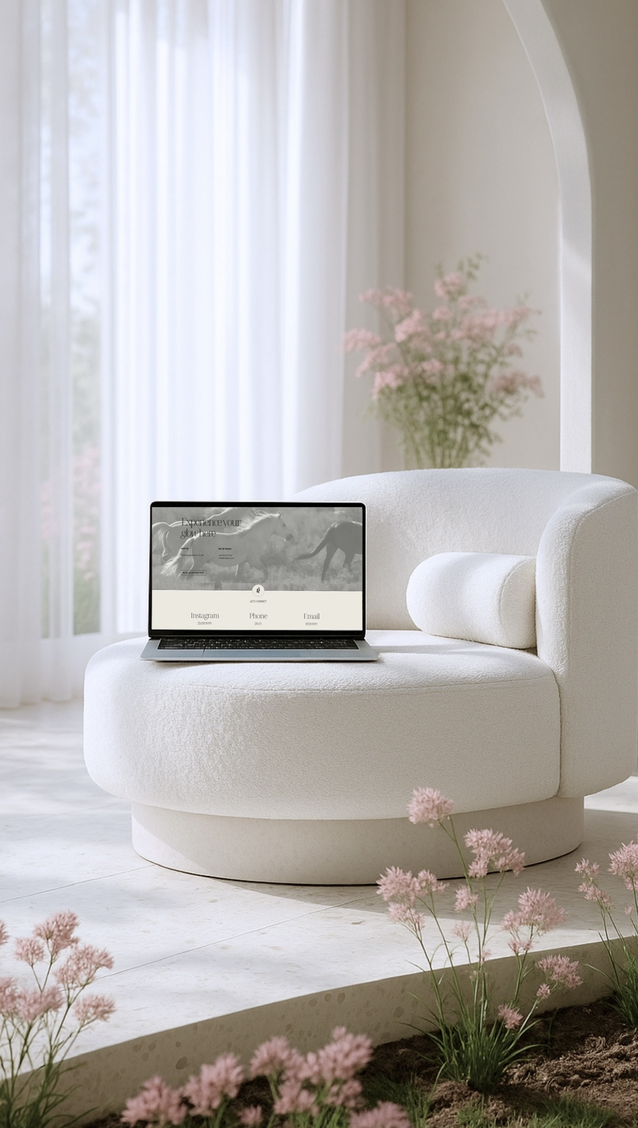
logo suite, color palette, typography suite, stationary design, web design & development
Project done
by Over the Mug

More about
the brand
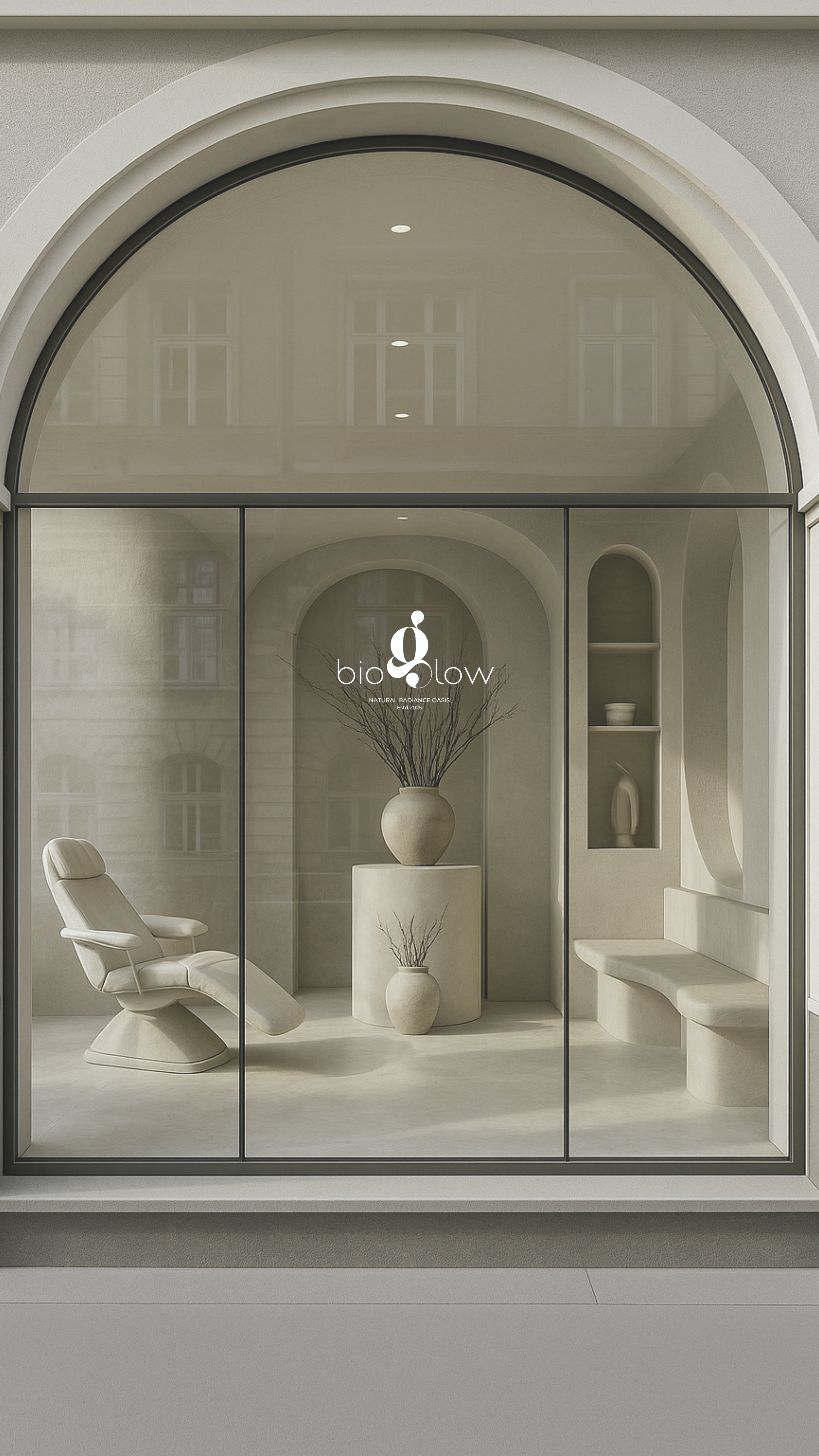
Bioglow was born from a friendship, shaped by years of experience in luxury spas and wellness spaces around the world. What began between treatments, sea breezes, and quiet cups of coffee grew into a shared vision: to create a space where women can feel fully supported — not just treated, but truly seen. Bioglow combines the precision of science with the warmth of care. Each treatment is thoughtfully designed to work in harmony with the body’s natural rhythm, using proven techniques and top-tier products. But what truly sets it apart is the atmosphere — calm, one-on-one, and entirely devoted to each client. This is not just skincare. It’s a return to oneself.

Story behind
the logo
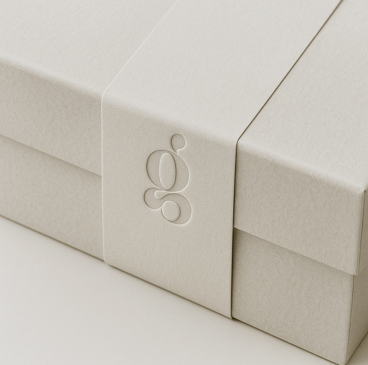
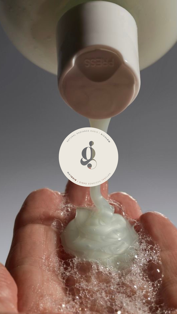
The Bioglow logo captures the brand’s essence: purity, harmony, and understated luxury. Its elegant, modern typography reflects science-backed skincare and a commitment to clarity, while the softly sculpted “g” brings an organic, fluid note that feels warm and naturally refined.
The circular submark symbolizes wholeness and balance: a visual echo of the brand’s philosophy of gentle, holistic care. Together, these elements form a calm, clean identity that mirrors Bioglow’s mission: skincare rooted in purity, elevated through harmony.
Color pallete:
typography suite:

